Design System Designer (Independent)
Frostbite Product Manager
Frostbite Quality Assurance
Jan 2025 – Present
Tokens
Components
Patterns and layouts Copywriting
Ongoing ownership
To rebuild the design system as a scalable, consistent, and flexible foundation that enables product teams to work faster and more confidently.
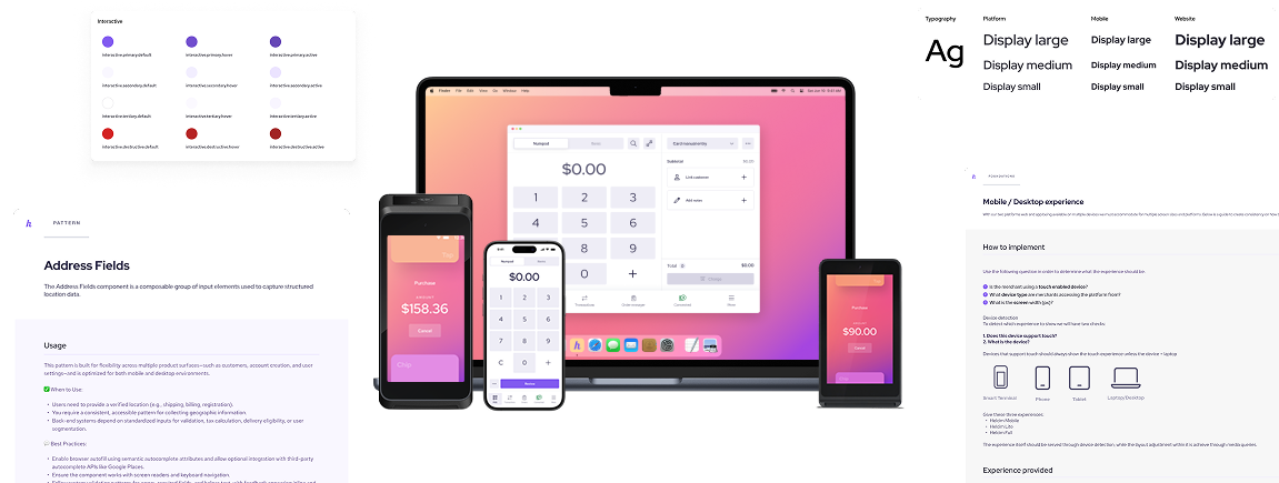
Helcim is a fintech platform supporting merchants across a complex ecosystem: a web dashboard (desktop and mobile), native mobile apps, a desktop application, and two payment hardware products—a large touchscreen smart terminal and a small-screen card reader.
I led the evolution of Helcim’s design system to unify these surfaces into a single, scalable system—balancing high-craft design with real-world constraints like screen size, input methods, performance, and accessibility across both software and hardware.
Teams were slowed down by both excess freedom and rigid governance.
The design system wasn’t enabling product teams — it was constraining them. The challenge was not just visual design, it was process, governance, and scalability.
Frostbite transformed the way product teams work:
Faster feature delivery: Teams no longer hit bottlenecks for small changes
Consistency at scale: Components and patterns are predictable, reducing bugs and duplicated work
Reduced cognitive load: Designers can focus on solving user problems, not managing 880 variants
Improved collaboration: Developers and designers speak the same language with tokens, patterns, and documentation
Scalable foundation: The system is built to grow intentionally, not accumulate snowflake components
Improved accessibility: Baked in accesibility to the component and tokens meant a more accesible expereince with less developer work
Frostbite became the system teams could trust — enabling creativity without chaos.
Instead of incremental fixes, I approached Frostbite as a full reset of the system foundation, balancing flexibility and control while keeping the end goal in mind: teams that can ship confidently and consistently.
I reviewed every component, variant, and token. Components that didn’t have a clear purpose were removed. This reduced cognitive load for designers and confusion for developers.
Rather than creating multiple versions for every device, components were designed to work first on mobile, then scaled only when necessary.
Introduced meaningful design tokens that describe purpose, not just style. This allowed teams to make updates confidently and consistently across products.
Moved away from a centralized bottleneck model, giving product teams autonomy while maintaining system consistency.
Established a three-tier system:
components → content patterns → layouts → UI patterns.
Teams could now quickly assemble complex pages without reinventing the wheel.
To strengthen system quality beyond UI, I Initiated and led a UX Writing Program to standardize product language and content patterns. Furthermore I introduced AI-assisted tooling trained on system standards to reduce support overhead and improve team efficiency
Design systems are less about rigid rules and more about shared understanding. By designing for constraints, advocating for flexibility, and investing in governance and education, the system became something teams could rely on—and evolve—without losing coherence.
This work reinforced my belief that the best systems quietly enable great product work while setting a high bar for craft across an organization.

If you like what you see and want to work together, get in touch!