Product Designer (Independent Lead)
Merchants + Internal Support Teams
Oct 2024 - Sept 2025
(Audit → Handoff → Release)
An efficient system that improves discoverablity and reduces reliance on the support team.
Settings lived across the platform like a puzzle with missing pieces. Merchants had no mental model for where to go, and internal teams struggled to explain behavior. Even the platform logic didn’t fully align with what users saw.
Pain points identified:
1. Disjointed merchant workflow
2. Hidden dependencies that blocked actions without explanation
3. Conflicting terminology between product teams
4. Poor content clarity and quality
5. Support calls becoming the unofficial help system
User impact:
Frustrating onboarding and day-to-day settings experience. Disjointed and coinfusiing workflows confuse new merchants the most.
Business impact:Adding unnecessary strain to support team, with an average of 40-60 settings-related tickets per month.
This wasn’t a UI problem — it was an information architecture problem that needed rebuilding from the foundation.
I focused on untangling complexity and designing the experience around merchants’ expectations, making settings intuitive, predictable, and easy to navigate despite underlying system complexity.
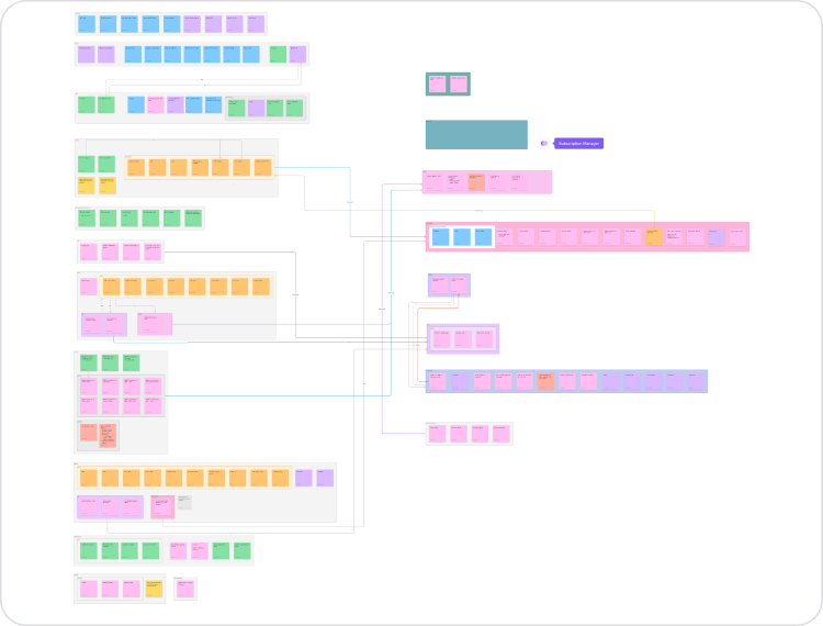
Mapping the real complexity
Every setting. Every edge case. Every dependency mapped in FigJam.
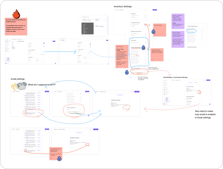
Design for descoverability over placement.
I rebuilt structure around how merchants think, not how the platform was built.
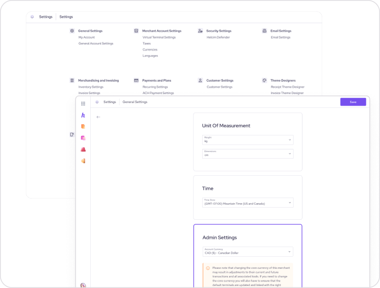
Strategic choices:
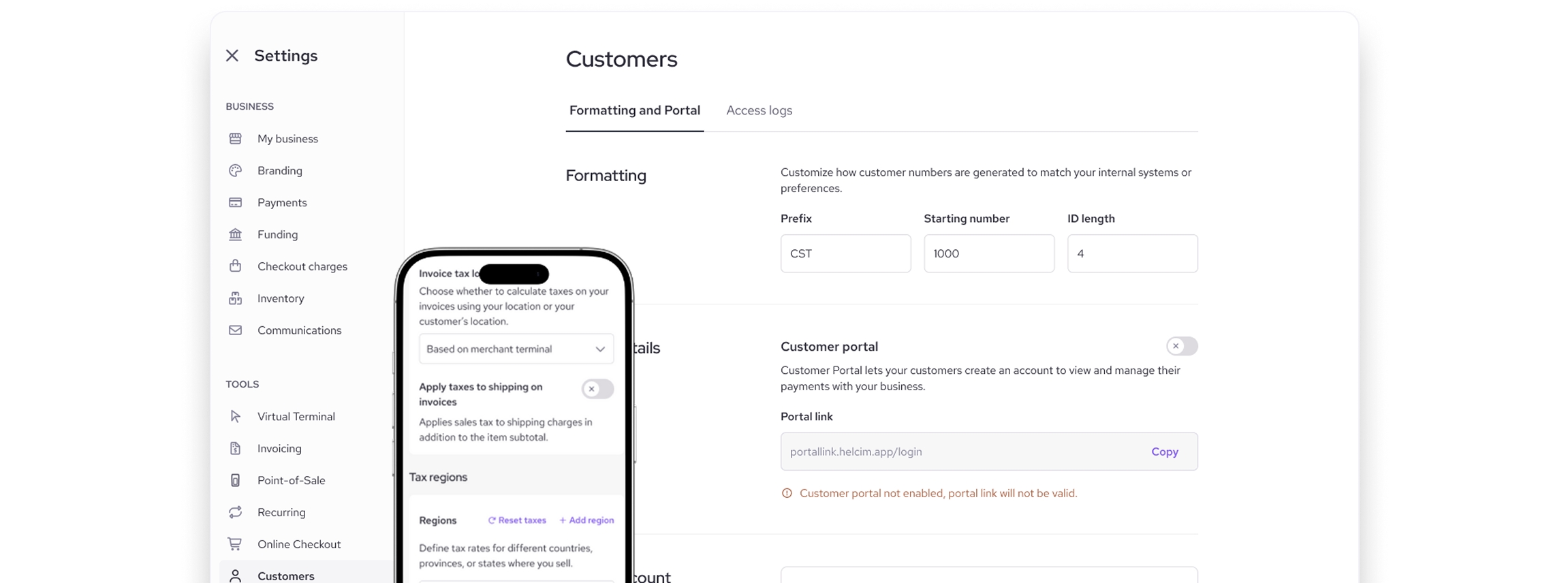
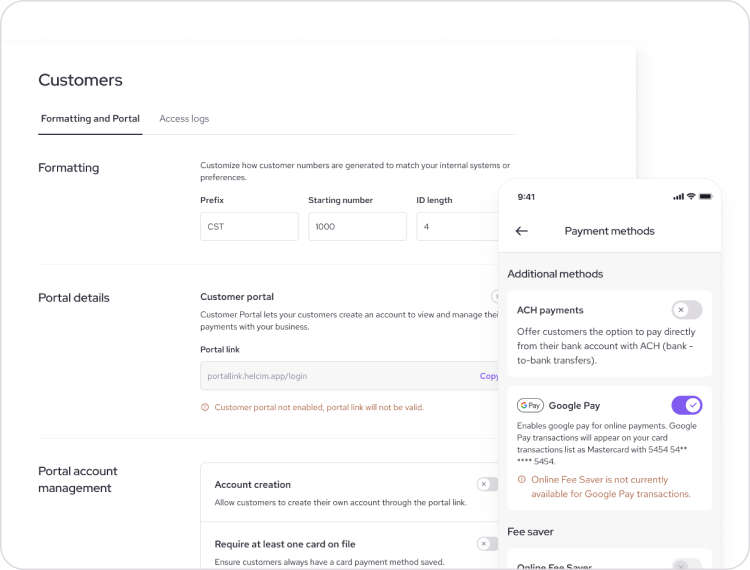
- Centralized access point (full-screen modal)
- General account - settings separated from tool-specific controls
- Grouped dependent settings to prevent error loops
- Standardized terminology after testing internally
Testing navigation logic, not screens
Instead of traditional usability tests, I tested the taxonomy itself.
- Internal participants w/ low–medium product knowledge
- “Where would you expect to find…?” tasks
- Terminology A/B comparisons
- Dependency awareness tests
This surfaced mismatches between our internal language and merchant expectations — and informed naming that actually reflected mental models.
Support calls dropped. Confidence went up.
The question shifted from “Where is this?” to “Okay, what’s next?”
Even small changes in a sprawling system can have unexpected consequences. Working through the scattered settings taught me that complexity doesn’t just live in the UI—it’s baked into the decisions, dependencies, and history of a product. Auditing thoroughly, designing for real user mental models, and collaborating across teams aren’t just good practice—they’re essential when trying to turn a maze into a smooth, navigable experience.
Over time, scattered settings and hidden dependencies built frustration into the system. Without ongoing oversight, even minor inconsistencies can cascade into major usability issues.
Understanding the full scope of a complex structure is critical — assumptions can hide systemic flaws. A detailed audit ensures decisions are informed by reality, not belief.
Systems evolve for technical or organizational reasons, but users navigate based on their goals. Aligning design with user expectations is essential when complexity spans multiple domains.
Settings touched nearly every team. Engaging stakeholders early avoids surprises and ensures design decisions reflect real-world constraints.
Large-scale structural changes benefit from phased delivery. Prioritize foundational improvements first, and layer refinements over time.

If you like what you see and want to work together, get in touch!